Implemented feature idea or fixed bug
There is too much space wasted vertically with such thick rows. Perhaps a 'compact display density' similar to what Gmail has.
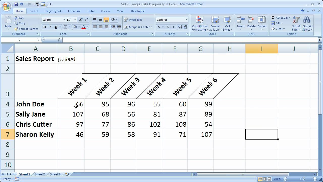
And trying to save space with horizontally adjusting the width of each column individually takes time and you end up losing some of the assignment names well before the available space is utilized. Perhaps writing the assignment titles at an angle would help like in this image: https://i.ytimg.com/vi/FlZovY2CaE4/maxresdefault.jpg
Comments (3)
The "Brainhoney" platform used to allow us to "collapse" chapters in the gradebook and focus in on the module currents were currently working in. It would be GREAT to be able to see the correct module when opening up the gradebook.
Hey T.O., BrainHoney did this by filtering the gradebook to the specific folder/module. You can also filter in Buzz and Buzz will remember your filter.
Hey Marc, in last week's update, we made the width of the grade columns dynamic so that they use much less space if you are displaying less data. I really hope this is a welcome addition.