Implemented feature idea or fixed bug
Currently, when grading a student's assignment when using a rubric, an entire line is used for a grade point and then on the line below, the description of the rubric appears. I typically use a four-subject rubric with group discussions. At present, the additional line spacing makes the rubric take up most of the screen. Here's a screenshot to illustrate the score line and description line gap:
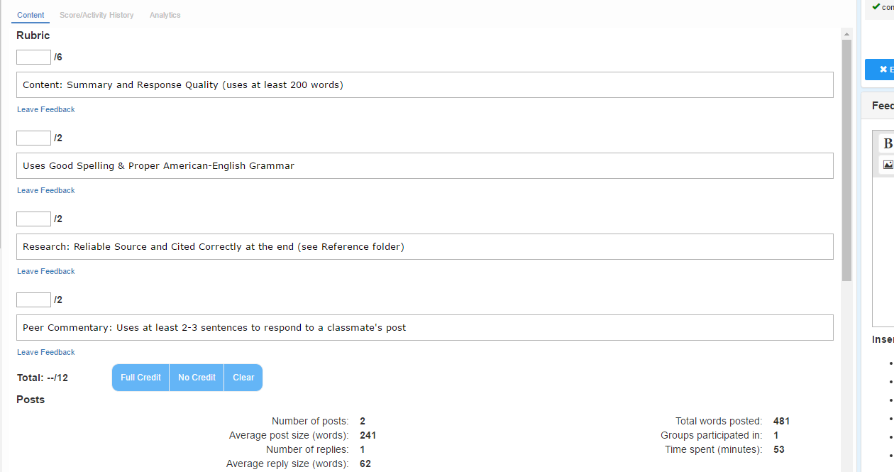
Using a rubric with this much spacing, I can't even see the student's post without scrolling. Can we tighten up the assignment presentations (less line spacing) so we can actually SEE the student's submitted assignment, too? (granted that with longer posts, that won't be possible, but a tighter, clean presentation should be possible).
Comments (1)
Yes, I wholeheartedly agree! Please tighten up the rubrics to make it more like the BH version! It is much faster to grade in BH than in Buzz. Also, we really need to be able to auto fill each line of the rubric with the total points, not just the entire rubric score like is available now.